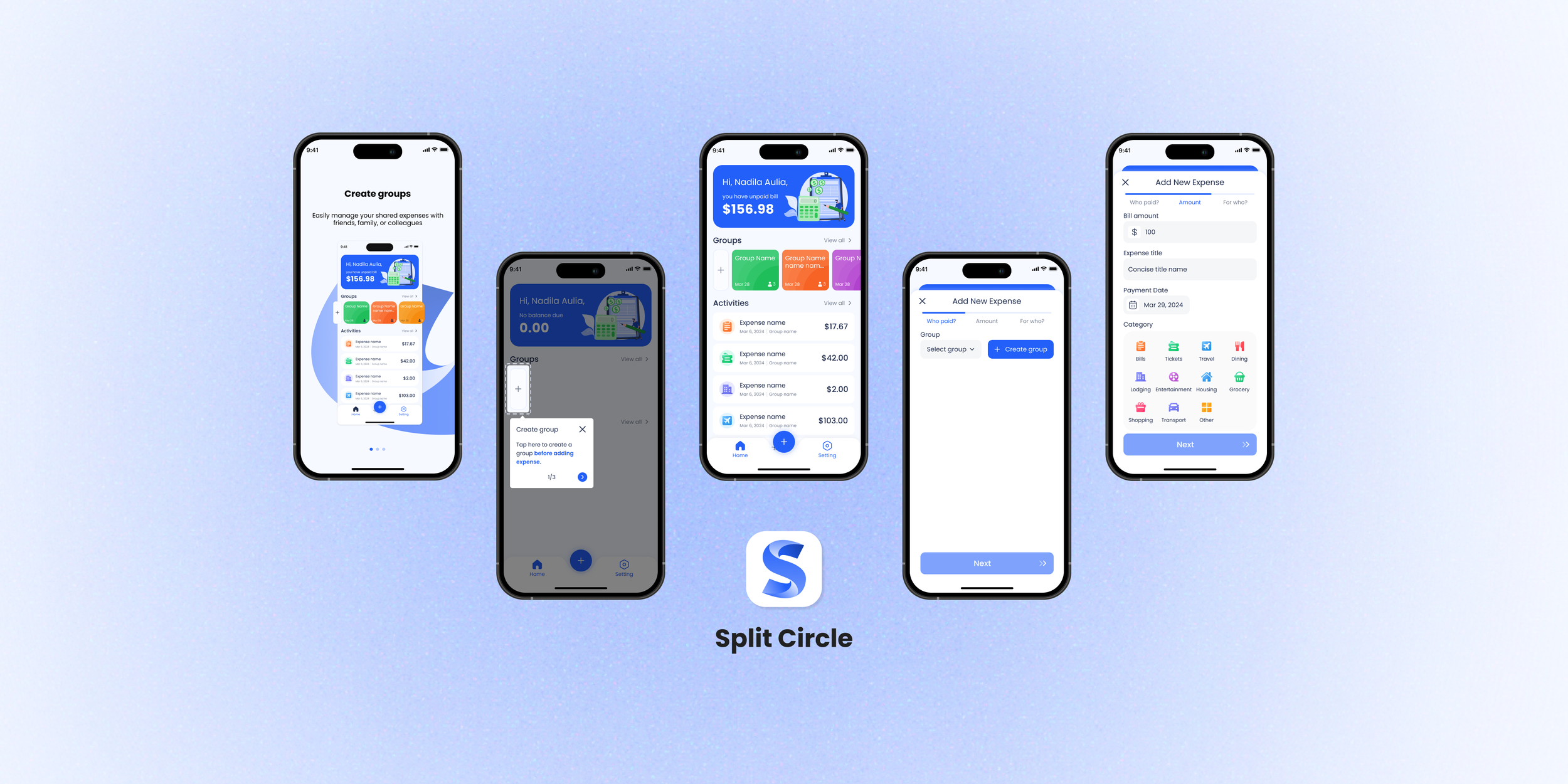
Split Circle
Go-to app for effortlessly managing shared expenses with friends and family.
Timeline
1 month
Deliverables
4 Key Experiences Hi-fi Prototypes
UI Handoff Documentation
role
Product Designer
What you can expect
A deep dive into one of the most memorable challenges I faced while working on this expense-splitting app. While this story doesn't encompass everything I did on the project, it highlights a particularly impactful problem-solving journey. If you're curious about other aspects of the project, I'd be happy to chat more!
An insight into my problem-solving process: You'll see how I tackled a seemingly unsolvable user flow issue by zooming out to see the bigger picture. This experience taught me that sometimes, the key to innovation lies not in looking closer, but in taking a step back.
A reflection on the importance of perspective in UX design. This case study demonstrates how shifting your viewpoint can lead to breakthrough solutions. It also highlights the value of iterative thinking, user testing, and collaboration with developers in creating effective user experiences.
Biggest Reflection
This experience taught me a valuable lesson. When you're too zoomed in on a problem, it's hard to see alternative solutions. Sometimes, you need to step back and view the whole picture.
Problem-solving is a dance of zooming in and out, constantly refocusing your perspective. It's in these moments of clarity that innovative solutions often emerge.

Most memorable challenge
Cracking the Code: Enhancing the Core User Experience
01. Understanding the Features
So, there I was, fresh on the Split Circle project. You know that feeling when you're handed a new app to work on, and you're like, "Where do I even start?" Well, that was me. But I knew I had to get my hands dirty first.
I spent time exploring the app thoroughly. I identified 3 main features that were central to the app's functionality. This helped me see the big picture of what Split Circle offered.
02. Talking with Stakeholders
Next, I sat down with the stakeholders - the people who know this app inside and out.
They shared their thoughts, including a big concern: they felt the main user flow wasn't very intuitive. This was a crucial piece of information.
03. Competitive Analysis
To gain a broader perspective on expense-splitting app designs, I conducted a competitive analysis of several popular apps in the market. This research was crucial in understanding industry standards and identifying potential areas for innovation.
I examined 5 different expense-splitting applications, focusing on their core functionalities and user flows.
04. Forming a Hypothesis
Now, here's where it gets interesting. Combining what the stakeholders told me with my feature deep-dive and competitive analysis I formed a hypothesis: the main user JTBD (splitting bills) might be the root of our problems.
Main flow for adding expense
05. Time to Test & Validate
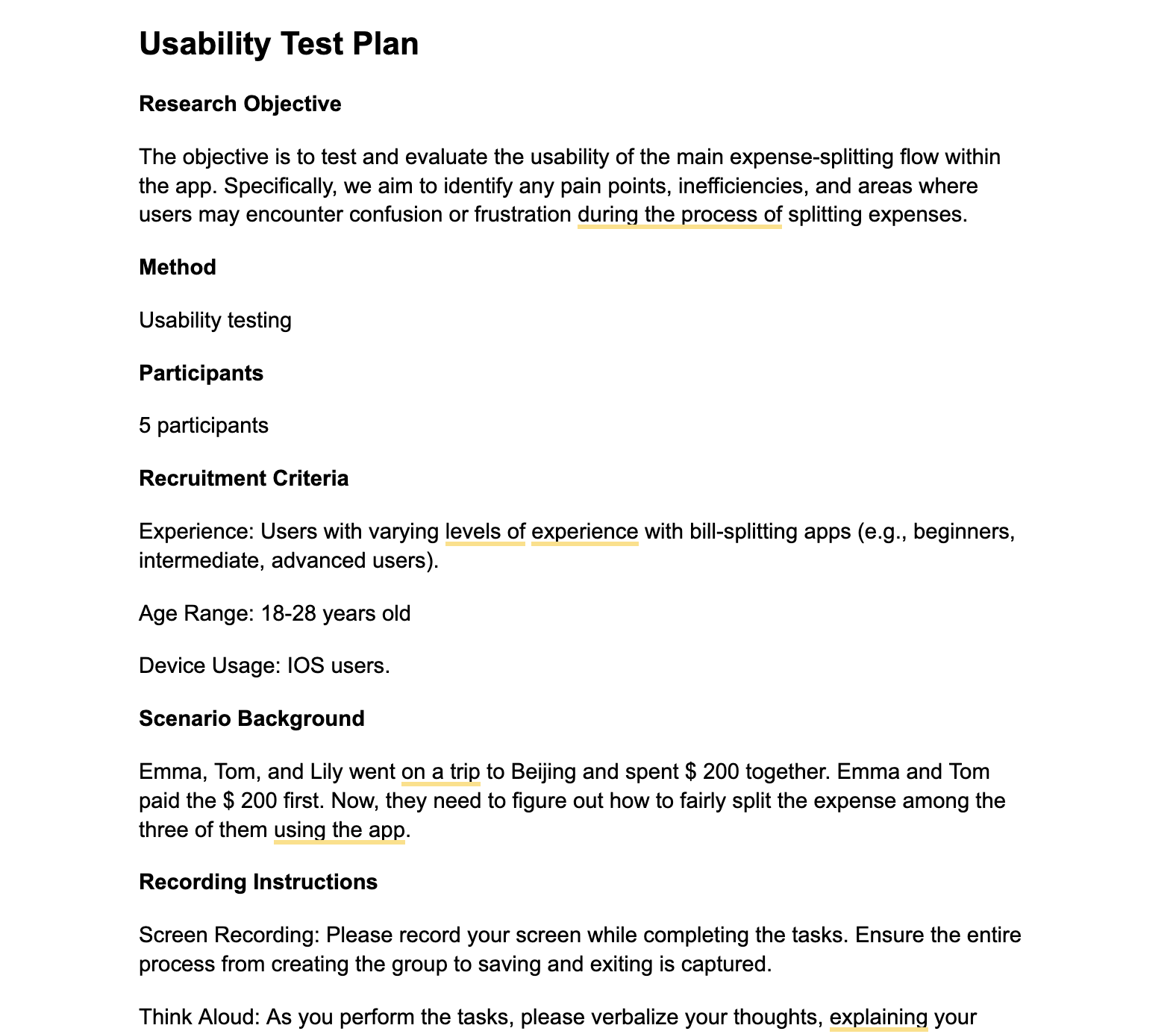
It was time to investigate further. I decided we needed to evaluate this solution. But how? Usability testing, of course! Now, I had a choice: go exploratory or evaluative.
I chose evaluative because we already had a specific area to focus on. This would help us pinpoint exactly where users were struggling.
06. Information Synthesis & Analysis
07. The Big Reveal
The results were unexpected.
60% of users had trouble splitting bills - our app's main function!
The issue?
The main button was for adding expenses, but users needed to create a group first. If they tried to add an expense without a group, they hit a dead end.
08. Take Action
a) I shared these insights with the stakeholders, presenting the facts clearly.
b) They were on board for improvements but had a constraint: they didn't want major changes to the flow due to time limitations.
c) To explore solutions, I did a competitive analysis, looking at 6 different apps for inspiration.
1. Guided tutorial
A step-by-step interactive tutorial when users first use the app (e.g. splittr).
2. Optimize the ‘who paid’ section
Users log in and go directly to the default group, where they can add bills within the group.
4. Onboarding flow to guide users
Add graphics and text for the onboarding page to instruct users to start with adding a group.
5. Example or recommendations
Provide a group as an example on the app homepage.
6. Button Emphasis
Display only one visible button on the page at a time
Add groups and members in the ‘who paid’ section (e.g. spendtogether).
3. Default Group Setting
d) Based on this research and initial feedback from stakeholders, I sketched out 4 potential solutions, listing pros and cons for each.
☹️ Potential Solution 1 ❌
Redesign the flow to split.
Project Requirement
This solution was considered too large of a change given time constraints.
✅ Pros:
A prominent button on the screen for adding groups and expenses makes the user flow clearer.
Separates activity and debt into smaller, more manageable units.
❌ Cons
Requires a major redesign.
Details need refinement.
Potential Solution 2
Implement a step-by-step interactive tutorial.
Preference Testing
User research showed that 5 out of 6 users preferred potential solution 2 due to its clarity and less forced approach.
✅ Pros:
Requires minimal changes to the current design.
❌ Cons
A mandatory tutorial might annoy users or lead them to skip important steps.
When users first use the app, start by creating a group in the onboarding process.
Before
Dev Feedback
The developers indicated potential solution 2 would be relatively easy to implement, making it a viable option.
✅ Pros:
Requires minimal changes.
Integrates well with the onboarding page.
❌ Cons
Directly creating a group without context might confuse new users.
VS
Users hit a dead end when trying to add an expense without a group. They must return to the home page to create a group first, then come back to add the expense.
Potential Solution 3
After
🤔 Potential Solution 4 ❌ ✅
In-Flow Group Creation: If users click add expense without any groups, provide a create group button instead of select group
Allow users to create groups directly within the expense addition flow, eliminating the need to navigate back to the home page and reenter all the info.
✅ Pros:
Minimal changes required to the existing interface.
Provides a more intuitive solution within the expense addition process.
Improves user flow by removing unnecessary navigation.
❌ Cons
Slightly disrupts the current flow.
🙂 Potential Solution 2 ✅
YES, BUT …
A. Adding expenses to pre-existing groups.
Dev Feedback
While this solution addresses the immediate issue, there's a potential complication:
After creating a new group, returning to the "Add New Expense" page might be tricky. We need to ensure that any information the user has already entered (such as amount or date) is preserved and repopulated when they return to the expense entry screen.
Iteration 1
Iteration 2
All without any data loss or backtracking.
My initial solution to solve this ”restore issue” was straightforward: place the "Create Group" button at the top of the expense entry page.
Simple, right? Well, not quite.
User testing revealed that people don't always fill from top to bottom. They often start with the amount – the first thing on their minds.
Back to the drawing board I went. For days, I stared at my screen, feeling stuck.
Then, one afternoon, as I was lost in thought, it hit me – I was too focused on the current page.
I needed to step back and look at the bigger picture.
Those with existing groups could select and move on to choosing the payer.
Users without a group could create one right away.
Shouldn't these be together? Following the principle of proximity, I made two key changes:
Moved the group selection under the "Who paid?" tab, integrating group selection/creation with choosing the payer.
Shifted "Who paid?" to be the first step in the process.
Dev Feedback
Excited, I presented this to our developers. They loved the solution but raised a concern: Would this align with users' expectations of how expense-splitting apps typically work (invoking Jakob's Law)?
B. Selecting a group before adding an expense.
C. Choosing participants on the same page as entering the expense.
This variety showed that users don't have a strong mental model for a "standard" expense-splitting flow.
To address this, I took two steps:
1. I went back to the earlier research I’ve done on popular expense-splitting apps.
Not Surprising, I found three main approaches:
2. I ran some rapid user tests. The results were encouraging – users found our new flow more convenient.
With this evidence, our development team was on board.
place the "Create Group" button at the top of the expense entry page so that users can fill forms from top to bottom to avoid any info restoration.
That's when I had my "aha!" moment.
Groups are about people, and the "Who paid?" step is about selecting people from a group.
We had our solution!
09. Final Solution
Contextual Tooltip + Intuitive flow
Before
After

Hi-Fi prototype
Onboarding
Browsing tutorial
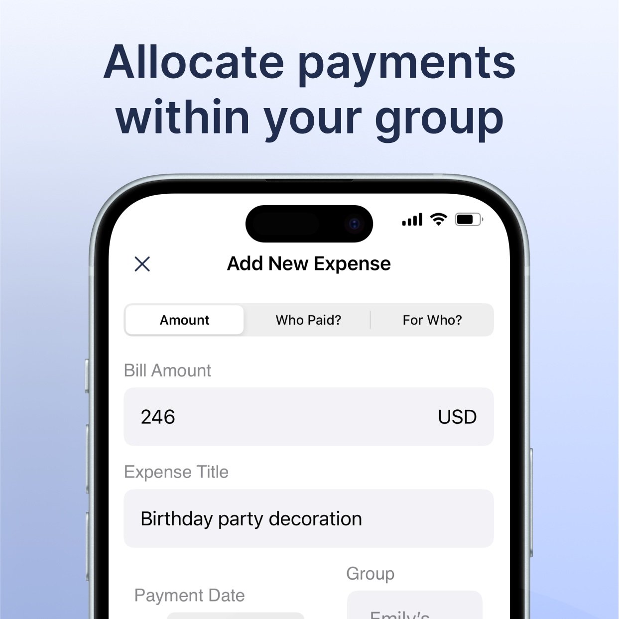
Expense creation flow
Methods for splitting expenses
Activities

UI Handoff
Thank you :)
Wesource
An app for free and low-cost resources
Check other projects
Coach Potato
From couch to coach
Website Redesign
Redesigning the Campus Food Bank website resources page


