Wesource
Help students effortlessly discover and access vital on-campus and off-campus resources.
Timeline
9 months
Deliverables
5+ Key Experiences Hi-fi Prototypes
Style guide
UI Handoff Documentation
role
Product Designer
What you can expect
Since this was my first real project, you're going to see a very MESSY process filled with frustration, struggle, and lots of reflection, learning, and enjoyable moments.
The journey was long, so to keep things clear and to showcase my thought process and different skills, I'll be sharing the highlights. Want to know more details? Let’s chat!
Reflection
At the end of the day, it’s all about solving the right problems and solving problems right.
And more importantly, keeping key stakeholders in the loop from start to finish.
That's where we product designers find success. Sounds easy, right?
But it took me a lot of efforts to learn how to present ideas more engagingly, deal with ambiguity, manage stakeholder expectations, design with intention, articulate my design decisions persuasively, make data-driven decisions, and get buy-in, etc.
Ready to dive into the story of my most challenging project? Let's go!
2-min summary of what this project is all about
Challenge
The significant information gap faced by University of Alberta students includes the critical challenge of knowing where to find resources.
Solution
Bridge this information gap by providing an effortless resource discovery experience for students.

Chapter 1
From chaos to clarity:
How I overcame doubt and MADE IT WORK!
It all started with a broad idea from my client:
"We want to build an app."
Hmm, okay, but WHY?
The clients continued:
"Let’s create a price comparison app, where students can add prices to help others find cheaper products."
Hmm, okay, but WHY?
It felt all too familiar—solving problems without knowing what the problem is or why we're solving it.

So, here's what I did to add clarity to those essential but unasked questions.
01. Understand Business Context
To get a clearer picture, I aimed to understand:
What's the goal?
Why are we doing this (more strategic vs. tactical vs. targeted)?
What's known?
What's unknown?
What's assumed?
What's uncertain?
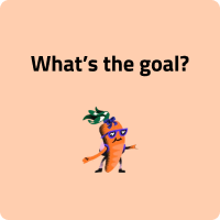

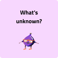
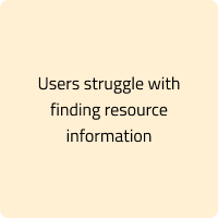
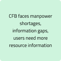
I facilitated a workshop and conducted stakeholder interviews to align on these questions, which significantly helped in making more informed decisions later in the design process.
Arriving in Berlin
02. Gather existing data
I collected existing data from a survey the client shared with me to understand the problem and potential opportunities.
03. Define the Problem
Analyzing data from the stakeholder interviews and survey, I quickly pinpointed the issue.
How can we reduce hunger in the university?
With this question, I conducted an extensive competitive analysis.
Reebee
Flashfood
04. A Rude Awakening
WHAT WE CAN ADDRESS V.S. WHAT WE CAN NOT ADDRESS
I presented my preliminary findings to the stakeholders. It was hard to admit, but what I quickly realized was that the first step to solving a problem is recognizing what we can and cannot address.
(Welcome to REALITY)
Unfortunately, with the available resources, tackling hunger wasn't feasible.
05. Quick Pivot and Re-focus
I didn't waste the opportunity of meeting with stakeholders. I asked more questions to gain a deeper understanding of their thoughts. From this, I clarified their desires with two layers:
Business
Do something, and expand the impact of the Campus food bank.
07. Presenting Insights
The interviews were a success. I synthesized the findings into three key insights and presented them to the client, along with some actionable next steps.
This time, I received very positive feedback from the client. The insights proved to be highly inspirational and provided direction for our design process.
01. The Rude Awakening
User
Improve client experience.
06. More research
With this vague strategic goal, I embarked on a second round of research. This time, I conducted user interviews to uncover unmet needs.
Two Memorable Moments
Realizing that tackling hunger wasn't feasible was a tough moment. This "welcome to reality" moment was hard to swallow but essential for redirecting our efforts towards something achievable and impactful. It also made me realize how crucial it is to clearly understand the scope and expectations right from the start of a project.
02. Positive Feedback from Stakeholders
This feedback was incredibly rewarding and validated all the hard work and research I had put in. It was a moment of triumph that reinforced the value of our approach and the importance of deep, user-centred research.

Chapter 2
My design challenges:
It's full of ups and downs, but WORTH It!
Overarching Pain Point: Information Gap
From the interviews, I discovered that students' pain points all boiled down to an information gap.
Specifically, there are three key aspects:
01
Gap in Where
Students often don’t know where to find resources.
02
Gap in Reliability
Students are unsure about the reliability of the resources.
03
Gap in Detailed information
Difficulty in obtaining specific information about resources.
I'll focus on how I tackled the first issue—helping students know where to find resources—to show my thought process and decision-making.

So…
HMW help students find resources easily and effortlessly?
01. Design Principles & Product Requirements
Before diving into the design, I thought about what principles should guide this experience. What makes for a good resource discovery experience? What are the crucial factors? After discussing with stakeholders, we agreed on three main design principles that would underpin our design process:
Simplicity
Clean UI Design: The app should have a clear design focused on simplicity and ease of use.
Straightforward Navigation: Implement intuitive navigation menus and clear labels for all buttons and links.
Clear Categorization
Category Grouping: Implement a categorization system that groups resources into logical categories (e.g., Food, Academic Support, Second-Hand Items).
Top-Level Categories: Ensure that major categories are accessible from the main menu or directly on the homepage.
Shortest Path Navigation
Direct Access: Minimize the number of clicks or steps needed to find key resources.
Quick Search Feature: Integrate a quick search bar on every page to allow users to instantly search for resources.
02. Solution Explore
To address the issue of students not knowing where to find resources, I explored several potential solutions and presented them to stakeholders for feedback.
Potential Solution 1: Community Resource Hub
A crowdsourced platform where users can post and share resources, helping to create a comprehensive and dynamic database of available resources.
✅ Pros:
Crowdsourced Contributions: Allows everyone to post resources, leveraging the community to reduce the manpower needed by the CFB (Campus Food Bank) for resource discovery.
Increased Resource Availability: More resources can be added quickly by various users, leading to a richer database of options.
Potential Solution 2: Community Resource Hub
❌ Cons:
Reliability Concerns: Stakeholders are concerned about the accuracy and reliability of the information posted by users.
Potential Misinformation: Risk of outdated or incorrect information being shared, which could lead to confusion and distrust among users.
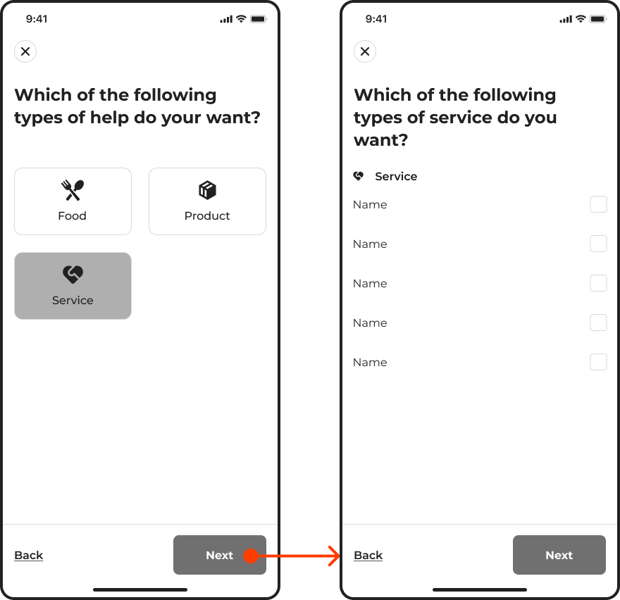
A guided, step-by-step resource discovery process that asks users questions and provides tailored recommendations based on their responses.
✅ Pros:
Personalized Experience: Customizes resource recommendations to individual user needs.
Simplified Navigation: Breaks down the search process into manageable steps.
❌ Cons:
Implementation Complexity: Developing and maintaining an intelligent recommendation system can be resource-intensive.
User Patience: Some users may find the step-by-step process slower if they already know what they are looking for.
Data Dependency: Requires comprehensive and accurate data to provide meaningful recommendations.
Potential Solution 3: Resource Navigator
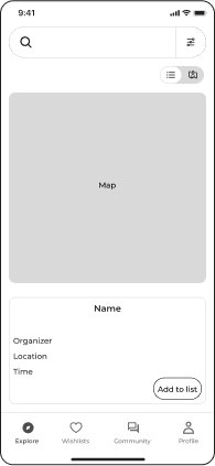
An app feature that integrates a map and a search bar to help users visually locate resources nearby and view detailed information about each resource.
✅ Pros:
Visual Guidance: The map helps users easily find resources based on their location.
Consolidated View: Combines map and list views for a comprehensive resource discovery experience.
Ease of Access: Prominently displayed search bar and categories enable quick searches.
❌ Cons:
Implementation Complexity: Integrating and maintaining the map with real-time data can be technically challenging.
Resource Density: High-density areas on the map can become cluttered, complicating navigation.
03. Decision
After presenting these ideas to the stakeholders and discussing the pros and cons of each, we carefully considered factors like reliability and data dependency. Given the need for accurate and trustworthy information, we decided to move forward with the Resource Pathway.
This solution provided a structured and personalized approach to resource discovery, ensuring that students could reliably find what they needed while minimizing the risk of misinformation.
Do you think that's it? Nah... it's just the beginning.
With the basic solution defined, I began focusing on the finer details of interaction and user experience.I asked myself:

HMW...
make it EVEN MORE EFFORTLESS?

Design Challenge 01
Effortlessly Switching Between Map and List Views
I started developing different concepts for switching between map and list views.
The goal is to create a seamless experience that allows users to toggle between visual (map) and text-based (list) navigation effortlessly.
01. Key Questions
I began by asking myself critical questions:
Which view should be set as the default? What do users want to see first?
How can we ensure that the switching process is intuitive and doesn't disrupt the user flow?
What design elements can we incorporate to make the transition between views seamless?
How do different contexts of use (e.g., urgent search vs. casual browsing) influence the preferred default view?
02. Analyze pros and Cons
Idea 1: Split-Screen: Half Map, Half List
✅ Pros:
Immediate access to both views; no need to toggle.
❌ Cons:
Split screen may be cluttered; limited space for each view.
Idea 2: Full-Screen Map with Toggle Button
✅ Pros:
Clear, unobstructed view of the map; easy to switch to the list.
❌ Cons:
Requires an extra step to view the list; potential confusion about the toggle button's location.
Idea 3: Map Default with Floating Button
✅ Pros:
Unobstructed map view; intuitive floating button for easy access to the list.
❌ Cons:
Users may overlook the floating button; depends on users understanding the button's function.
03. Secondary Research
I conducted secondary research to gather insights from existing app designs, and here are two key findings:
A. Many successful apps use a floating action button at the bottom for toggling views.
B. I noticed that Airbnb shifted from a split-screen design (Idea 1) to using a floating button (Idea 3).
These two findings raised my question of why this design is favoured.
04. Validate Solution
I conducted a quick usability test to validate each idea.
Surprisingly, I found that:
A. The split-screen design (Idea 1) almost universally caused users to take an extra step to hide the list, as they preferred exploring the map first and opening the list only when needed.
B. The toggle button in Idea 2 was not as noticeable as the floating button in Idea 3.
05. Design Decision
Based on these insights, I chose the third concept. The usability test indicated that users naturally gravitated towards exploring the map first and used the list as a secondary tool. The floating button design best supported this behaviour, providing an unobstructed map view with easy access to the list when needed.

Design Challenge 02
Effortlessly Browsing Resources Card
Then I started a more nuanced design for the list view.
01. Objective
Design an effective resource card layout that balances the display of crucial information and provides a seamless experience. The layout should maximize information visibility while maintaining a clean interface.
02. Key Questions
I started by asking myself:
What information is most important for users to see at a glance?
How can I ensure that users can access detailed information quickly without overwhelming them?
03. Design decision
1
2
3
I chose screen 3 for:
Combining images and text enhances the page's aesthetic appeal.
The cards in screen 3 provide maximum information in limited space.
Adding chips for food, products, and services helps users quickly filter resources.

Design Challenge 03
Effortlessly Using Resources Filter and Category Chips
01. Objective
Design a filtering system that accommodates a diverse range of resources without overwhelming the user. The solution should provide quick access to commonly used filters and ensure users can easily locate the resources they need.
02. Initial design
Initial thought
I believed having three chips (food, product, service) would allow users to quickly filter resources.
Placed the list/map toggle switch next to the category chips for easy access.
03. Feedback and insights
Design decision
Implemented all resource types as chips for comprehensive filtering.
Removed the filter button to reduce confusion.
Usability Testing
I conducted multiple usability tests with the revised design.
Findings
The long list of chips felt endless and made it difficult for users to quickly locate the desired resource.
Users were overwhelmed by the number of chips and found it hard to navigate.
I asked myself
How can I manage a large number of chips without overwhelming users?
Which resource types are most commonly used and should be prioritized?
Final Decision
Retained commonly used categories (e.g., no online resource, price, food bank) as chips.
Put the filter back but kept it close with the chips so that there is no confusion.
Moved less frequently used categories into a filter dropdown for easy access without cluttering the interface.
I got stakeholders’ feedback that the variety of resources is vast, making it difficult to encompass all types with just three chips.
Having both chips and a filter was confusing.

Other Key Experiences
Insights
Gap in Reliability: Students are unsure about the reliability of the resources.
Solution
Community and Reviews:
Peer reviews and ratings for resources to build trust and address the reliability concern.
Discussion forums and support groups for mutual aid and additional information.
Insights
Gap in Detailed Information: Difficulty in obtaining specific information about resource.
Solution
Comprehensive resource descriptions, including availability, contact details, and usage instructions.
Real-time updates on resource status to provide up-to-date information.

Component library & UI Handoff

Final Screens
Wide variety
Use filters to help users explore resources and fulfill specific needs.
Let the user speak
Users can check and review resources to ensure the authenticity and reliability.
Map or list
Toggle between map mode and list mode for easy resource discovery.
Friendly community
Connect with others in the community and find partners.
Tracking availability
Get up-to-date information and stay informed about food availability.
Never forget
Easily browse resources by bookmarking them as favorites.
Thank you :)
Split Circle
Go-to app for effortlessly managing shared expenses
Check other projects
Coach Potato
From couch to coach
Website Redesign
Redesigning the Campus Food Bank website resources page


